Monday, July 29, 2013

Hate Crime Statistics

My dissertation was about the impact of heteronormativity (a.k.a. societal homophobia) on suicide rates. Well, really it was about how to measure local variation in heteronormativity, and suicide happened to be an convenient health outcome: it's a "hard end-point" meaning that it is captured with little error, it's assessed pretty much the same way everywhere across the country and over time, and it's probably related to heteronormative societal attitudes.
One of the first ideas I had about how to measure local variation in heteronormativity was to look at hate crimes statistics. The logic is that hate crimes are a direct and extreme expression of heteronormativity. The FBI issues a report every year documenting the number of crimes reported as being bias-motivated, and also where they happen and against whom the violence is targeted.
But a strange thing happened when I looked at the data - there were a fair number of bias-motivated crimes reported from San Francisco and New York City, and virtually none from the places I expected to be havens of homophobia. The most likely explanation is that the number of hate crimes reported is a lousy measure of the number of hate crimes committed, and is a better measure of the degree to which a person reporting a hate crime to the police is taken seriously. So, in a way, hate crimes reporting may be a decent measure of heteronormativity, but in the opposite direction of what you'd expect at first: the more hate crimes reported, the friendlier the social environment is for TBLG people.
But, it gets more complicated. There are two ways not to have much conflict between dominant and subordinate groups. One way is for everyone to get along. Another way is for the subordinate group to "mind its manners" and steer clear of offending the sensibilities of the dominant group. So even if the incidence of hate crimes were a good measure of homophobia, it would be complicated because you'd expect the number of crimes to be low in areas where gay people have learned that the best thing to do is stay deeply closeted, or to get out of Dodge. And even though areas that are "gay meccas" allow us to express ourselves more freely, this can incite hardened haters in our midst to violence, like Dan White. "Gay meccas" can also attract hardened haters with violent intentions, and thus one often sees violent hate crimes centered around gay bars and cruising areas.

Anyway, it had been over ten years since I looked at the hate crimes data, and a lot happened since then. So I was curious to see what has changed.
Not as much as I expected. There are more and more local and state police forces reporting hate crimes to the FBI, but the number of reported hate crimes hasn't changed much, except for a spike in 2001 related to the violent backlash against Arabs and Muslims. If anything, there's a downward trend when you take the growing population into account (which I have not done in these graphs).

I have to admit, I'm intrigued by data like this. I don't know what story they are telling. I anticipated that with the rapid change in societal attitudes about homosexuality, we'd see a steady growth in the number of reported anti-gay hate crimes. But, as you can see in the graph below, the number of reported anti-gay hate crimes rose pretty steadily until 2001, and has pretty much leveled off since then.

So maybe that's a good sign - of increasing tolerance, acceptance, and even celebration breaking out in some corners of the country. But it could mean a lot of things, and when you dig down into where these anti-BLG crimes are being reported from, it's still predominantly from the gay meccas - large coastal cities and also university towns all across the country. I suspect that there are lots of anti-gay crimes not being reported at all, especially in rural areas and the South.
Maybe the peak in 2001 highlights a shift in the attention of bigots, towards a new bogeyman. There's certainly plenty of evidence that anti-Arab (much of the darker orange slice in the graph below), and anti-Muslim (the bright green slice in the next graph down) spiked hard in 2001, and there has been a sustained increase in anti-Islamic crimes since then compared to the 1990's. But I think the idea of bigots turning away from the gays and towards the Muslims is at best a partial story. Also of interest to note in the graph below is that the number of anti-Black crimes reported by the FBI was definitely lower in the first two years of the Obama administration. Evidence of a post-racial America? I strongly doubt it - although the post-racial narrative might explain it if one considers that some of the more "post-racist" (emphasis on racist) police may be harder to convince that a bias-motivated crime has occurred, and thus less likely to report it as such. It would certainly be interesting to look at those trends in the wake of the 2010 retrenchment election.


 So, another interesting thing to note in the graph above, is the absolutely tiny number of hate crimes motivated by anti-atheist sentiments. As a hard-core aptheist myself, I find it hard to believe that there are so few anti-atheist hate crimes reported. Maybe it's an issue of confusion - how do you classify a religiously-motivated attack when the recipient professes no religion? But I suspect another possible explanation, that theist (after taking the double negative out of "anti-atheist") biases are so entrenched that it is hard for police to see theist motivated crimes as bias-motivated, and therefore not report them as such.

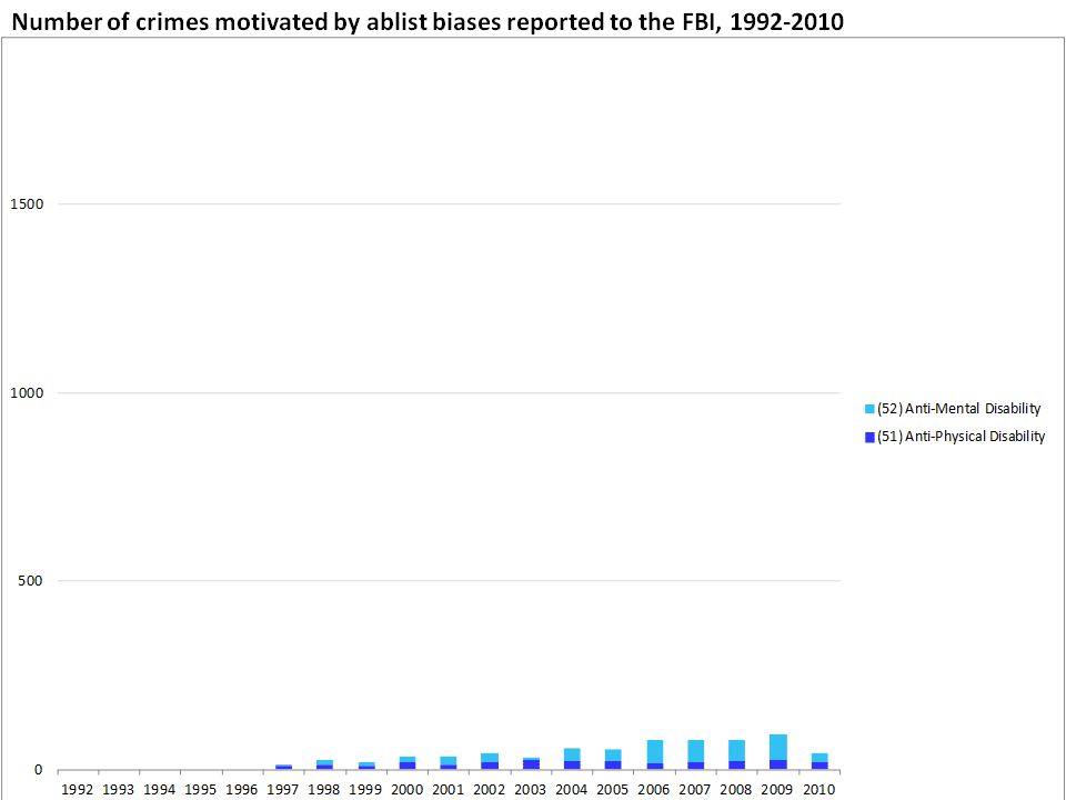
Another interesting twist to the tospy-turvy  world of hate crimes reporting is the biases for which no reporting category is even available. There were no crimes reported as being motivated by ablism before 1997. It's not that a glorious heyday of equanimity passed in 1996, but rather that there was simply no category available even to describe these bias motivations in the FBI's system. Even today (or at least up to 2010), the number of crimes reported as being directed by ablist biases numbers in the dozens per year, across the entire country. So here's another example indicating that the nature of the bias itself prevents it from being recognized and recorded.
So, that seems like a pretty exhaustive list: crimes motivated by bias on the basis of race, ethnicity, religious preference, sexual orientation, and ability. Or does it? Notice that there's simply no category to record crimes motivated by bias against transgender people yet, or intersex, or even bias against women. I wouldn't be surprised if the number of reported hate crimes would double if rapes motivated by misogyny were reported as such.
Also, in a nation where most sources of intolerance are weakening, intolerance against fat people is on the rise. Plug for a great article on anti-fat bias and media portrayals of disembodied depersonalized fatness.

I have to admit, I'm pretty ambivalent about organizing around hate crimes as a means to end prejudice. It's not for lack of trying. As my time with ActUp/RI wound down, I turned to advocacy around hate crimes - even made myself into a bit of a spokesmodel in the wake of being beaten about the head on Thayer Street in Providence (that's me standing and gesturing to another victim in that attack). I got involved in training a few police departments in Rhode Island, but I found that re-hashing my story as a hate crime "victim" was a source of re-victimization, and left me feeling dis-empowered and alienated, especially after some of the more intense police training sessions.

Friday, July 12, 2013

Allowing Gay Blood Would Increase Safety

The FDA still maintains a lifetime ban on gay and bisexual male blood donors. It is tempting to see this ban as overt homophobia, although I'd like to think that the decision-making body at the FDA has some other rationale in mind, at least in part.
They claim is that the ban increases the safety of the blood supply.

And so we have the ideal set-up, pitting "Safety" against "Homophobia". A battle between Rights, with Science judging the fight.

Is a lifetime ban on gay blood donors safer than allowing gay blood donors to give without restriction? Sure, but that's not an alternative that anyone is advocating for.

Some advocates for changing the policy deferring gay/bi male donors claim that all the blood is tested anyway, so we don't need the ban.
All the blood is tested for HIV, but there are cases where the blood tests negative even though it is infected, and one of those circumstances can be when a person has just been infected, and often the blood is highly infectious during that "window period". So, it is judicious to reject gay/bisexual donors who might have been infected recently. I think the best solution there would be to apply the same criteria used to defer anyone else who might have been infected recently, to say you can't donate for a year after sex with another man, even with a condom.
I've heard two logical arguments for why to exclude gay and bisexual men from donating blood for longer than a one year window - one is that there are extremely rare cases where an established HIV infection would still test negative, and the other is that the blood is tested only for those viruses that are pretty common and that they have good tests for - it isn't possible to test for everything, certainly not things we don't even know exist yet. I think both of these arguments from the side of "Safety" are compelling, but they don't operate in a vacuum.

Nobody is arguing for gay and bisexual men to be able to donate without restriction, so the question is what restriction will maximize "Safety" while reducing the role of "Homophobia" in making blood donor deferral policy? Often this is portrayed as though it is a balancing act, where every reduction in homophobia compromises safety.

But there are good reasons to think that reducing the role of homophobia in blood donor deferral policy would actually increase safety. Notwithstanding all the discussion about "window periods" and emerging infections and so on, there are three important phenomenon going on related to how people respond to a deferral policy that reeks of homophobia. How do people react when confronted with a policy that sounds, smells, and tastes like prejudice?

Frankly, some people are comforted by it. I'm sure there are lots of people who feel like the blood supply is safer because they believe gay and bisexual donors are excluded from it. They may make my stomach churn, but they don't make much difference in my argument.

Most gay and bisexual men are revolted by the policy, and as a result wouldn't touch blood donation with a ten foot needle. Again, not relevant to my argument.

Some gay and bisexual men, however, have learned that the easiest way to negotiate homophobia is to lay low. Keep your voice down and your wrists locked in position. Where this presents a problem is that given the choice between potentially outing oneself or deflecting the question about whether you've had 'sex with another man, even once', some men who should be deferred just slip past the question using the same techniques they've learned in dealing with other homophobic situations. Changing the policy so that it doesn't reflect homophobia (say by changing the deferral criteria to be the same as other HIV risk factors) would actually make the blood supply safer in regards to this group.

The second group I'm thinking of is predominantly heterosexual, but really could potentially include any donor. By including a deferral policy that sounds, smells, and tastes like rank homophobia, it "cheapens" the validity of other deferral policies, leading to people being less careful answering them. What I mean is that when the basis of one deferral policy is so obviously shaky, some potential donors will think that the other criteria (such as which drugs you've taken recently, or travel history) are also not strongly based in the need to keep the blood supply safe, and may be "encouraged" to give a less than honest answer, especially if they feel any social pressure to donate.

The third group I'm concerned about are the people who don't start giving blood at all. And the blood banks are worried about them too. Lots of people become regular donors for life after getting started in high school and college. But young people these days are especially sensitive to the acrid stench of homophobia. So by maintaining this policy that sounds, smells, and tastes like homophobia, the FDA is turning potential donors away in droves. Potential donors who are at very low risk for HIV and other blood-borne pathogens. Potential donors who otherwise would be likely to save dozens of lives over the coming years. There have even been organized efforts to keep blood drives off campuses until the policy changes.

The most dangerous pint of blood is the one that's not there when you need it.

Dear FDA, it's time to bring your deferral policy into the 1990's. Dump the homophobia and increase the safety of the blood supply.

Wednesday, June 19, 2013

Obesity a Disease? You can kiss my plump ass, AMA!

The American Medical Association voted to call obesity a "disease" on Tuesday - and I'm scratching my head to figure out why. It's obvious that obesity not a disease. A "risk factor", sure. But a disease? Give me a break. What's next? Avarice? Impatience? Ugliness? Tanning?

I see prejudice in this vote. Prejudice against fat people. A prejudice that has barely been talked about at all in the public health debate about what to do about the rapidly growing number of fat people in this country, and around the world.

While Mayor Bloomberg and his interventionist allies in public health have been hounding us (everyone: fat, formerly fat, and fat-to-be) the major accomplishment has been to make generations of people feel bad about their bodies, bad about themselves, and ashamed to talk about it. Well, I for one am FED UP!

Despite our obsession with fat-free, sugar-free, xxx-free foods that are described primarily by what is absent from them, our collective waistline continues to expand. Perhaps it is that obsession that leads to the obesity "epidemic".

I don't pretend to know what's causing the obesity "epidemic", and I think anyone purports to know is too confident of their own opinions. What I do know though is that there is a ton of irrational prejudice about fatness, and I've certainly got my share of it. I hate how my body looks. And I hate that I hate how my body looks.
I'm thinking of parallels to the gay rights movement - should I "come out" as fat and proud? I can see some theoretical benefit to that approach, but to be honest with you, I'm not the least bit proud of being fat, and I don't feel like faking it just to see some potential benefit on the other side.
But I'll tell you this - I for one really don't appreciate the AMA telling me my fatness is a disease, and I'm working up an appetite to do some research on how anti-fat prejudice affects people's health.

And the winner of the gay marriage debate??? Heterosexuals!

I'm sorry to say it, but there is already a clear winner in the gay marriage debate: heterosexuals. In the 1970's we absolutely and flatly rejected marriage as oppressive, not to mention the ultimate definition of "square".
We tried every possible alternative. Vigorously.
And yet, we came crawling back, hat in hand, saying we want in too. A major defeat for gay liberation, a major coup for normative heterosexuality.

But, while we were out sowing our wild oats, we learned a few things - you could say we picked up a few tricks. We do marriage differently, and if straight people have any sense, they'll be paying attention. I'm not the first to say it, but in many ways, gay marriage has saved straight marriage from passing into obsolescence.

A lot of heterosexuals are paying attention. A couple weeks ago, Slate's Double X Gabfest had a good discussion about what straight people can learn from gay marriage. They dove deep into all the stuff about gender roles, and differentiation of tasks within couples, and how "gay" marriage shows that those two ideas can be de-coupled, re-arranged, and yet there are often strengths to being different, even unequal, in a relationship. But I was surprised that the Slate commentators didn't want to touch monogamy - or rather the ability to discuss its alternatives - the biggest and best innovation we've brought into the marriage covenant.

Wednesday, May 29, 2013

Trends in Motor Vehicle Accidents

Every once in a while, I like to see what's going on with motor vehicle accidents. It turns out there's a lot going on. This data is from the Fatal Accident Reporting System. I haven't done anything special with it, just graphed the rather bland spreadsheet there on the home page.


 The obvious thing that jumps out at me is that after decades of increases in motor vehicle deaths (the trend goes back to the very introduction of the automobile), we seem to have hit a turning point in 2005, and there were huge drops in motor vehicle fatalities in 2008 and 2009 especially.
The other thing that jumps out at me is the increase in the number of motorcyclists killed on the roads (the purple bars), and perhaps a decline in pedestrian deaths (green bars), and certainly a decline in passenger deaths (bright red bars).
The timing of the precipitous drop in 2008 and 2009 certainly suggests a connection to the recession - fewer vehicles on the roads = fewer deaths. That decline in vehicles would presumably come from three sources: fewer trucks delivering goods, fewer commuters, and fewer errands and pleasure trips. But why would there be more motorcyclist deaths? Perhaps the aging of the baby boom generation? And I haven't got a clue about why there would be fewer pedestrian deaths. It would be interesting to see whether the decline in pedestrian deaths is also linked to the 2008-2009 drops - and could that be attributed to fewer commuters? Or fewer errand and pleasure trips? The drop in passenger deaths seems to be pretty strongly linked to the recession - so is that about less car-pooling among the remaining commuters?
At any rate, graphing the number of deaths is a bit misleading, because the population keeps growing.
So, when you divide the number of deaths by the population (and multiply by 1,000,000), the peak year isn't 2005, but 1995. Actually, if you trace these trends back, the peak year on a per population basis is some time back in the 1920's, when cars were just mowing people down left and right, with very little effort to make the vehicles, the roads, or the drivers safer. What you see in the long term trends is a long slow decline in motor vehicle death rates, followed by a rapid decline in the 1970's, linked to that decade's recession, and also the high price of gas (much much higher than today once you take inflation into account), speed limit restrictions, the imposition of seat belts, investments in improved road infrastructure (guardrails etc.), and a radical shift in how we viewed drinking and driving. The slower decline continued in the 1980's through the late 2000's, especially due to air bags, improved vehicle construction, lighter vehicles that do less damage to others, and continuing trends in driver, vehicle, and road infrastructure safety. But that drop in 2008/2009 is still really dramatic, and I have to wonder if it can all be attributed to the recession.
Presumably, if the decline is due to the recession, it should be directly related to how many vehicles are on the roads. So, if you divide the deaths by 'vehicle miles traveled' instead, it should smooth out the trend...

And that seems to be the case. The long trend towards lower deaths per mile traveled dominates, but there is still an extra bump in 2008/2009, suggesting that the recession not only reduced the number of miles traveled, but also made the miles traveled safer, especially for passengers and pedestrians.

So, as we climb out of the recession, I'd expect to see the number (and rates) of motor vehicle deaths increase a litttle bit, maybe as high as 120 per million residents per year or 12 per billion miles traveled, and then continue the long slow decline.

So, here's another example of major improvements in health being made. Not as sexy a story as the latest fad in diet, but it's good to be reminded once in a while about what's going right.

Monday, May 20, 2013

Data Unicorns

How many unicorns are in your data? Sounds like a silly question. But there can be some major problems when we don't think to ask it. Because every dataset has what appear to be unicorns in it - impossible combinations of data made possible because of infrequent errors.

Rob Kelly, Blackout Tattoo Studio, Hong Kong
Usually it's not a problem because the unicorns make up a really small proportion of your sample. And if the data combination is in fact impossible, or makes up a tiny proportion of what you're really interested in, you can just ignore them, or even try to "correct" them if you have additional information. But when you're interested in a rare phenomenon, it can be hard to tell the difference between unicorns and the real cases you're interested in.

Gay Blood Donors

Take, for instance, a paper I've been working on for years about estimating how many gay blood donors there are.

If the American Red Cross's procedures were followed to the letter, there shouldn't be any because any man who has "had sex with a man, even once, since 1978" is supposed to be excluded. In other words, any apparent gay blood donors should be unicorns –impossible data combinations.

We know that there are some, because every once in a while, someone tests positive during the blood donation screening process, and when they go back to interview the donor, some donors admit to "having sex with a man, even once, since 1978". But we have no idea how many HIV- gay blood donors there are, how many men who are giving on a regular basis without incident, despite the ban.
So, I've been looking at various datasets trying to get a rough idea of how many gay blood donors there are, trying to make the point that the ban on gay male donors isn't just discriminatory, it's also ineffective. And if we could talk with the men who are giving blood regularly without incident, maybe we could develop new exclusion criteria based on what they are doing.

It sounds simple enough, look up how many gay men there are in these datasets, and count how many of them are giving blood. But here's the problem. There are errors in counting who's a gay man, and also errors in counting who gives blood. So, any heterosexual male blood donor who is inaccurately coded as gay or bisexual will appear to be a gay/bi blood donor. As will any gay/bisexual non-donor who is accidentially coded as a blood donor. Let's start out with some plausible (but made up) numbers to illustrate...

Let's give ourselves a decent-sized dataset, with 100,000 men in it. Suppose that 95% of the male population has not "had sex with a man since 1978", and 5% of them have given blood. That's 4,750 straight men who are blood donors.
In the 1970's the Census did a big study where they interviewed people twice, and found that in about 0.2% of the cases, the two interviews resulted in a different sex for the respondent - about one in 500. So, what if 0.2% of these 4,750 guys who are giving blood without bending the rules at all get mis-coded as gay or bisexual - that's about 9 cases of what appear to be excludable blood donors.
Let's just make a guess that instead of 5% of heterosexual men giving blood, that 0.5% of gay/bisexual men do. Then we've got 100,000 x 5% x 0.5% = 25 cases of gay/bi men who are giving blood despite the ban.
So, all told, it looks like there are 34 gay/bi blood donors, but only 74% of them really are gay/bi blood donors.
But what if 0.06% of gay/bi men are really giving blood? Then there would be 3 real gay/bi blood donors, but there would appear to be 12, and only 25% of them would really be gay/bi blood donors. Most of the time, we'd be looking at unicorns.
What's frustrating is that I can't tell the difference between these two scenarios. I can't tell if my unicorn ratio is only 24%, or if it's 75%.

There's another problem, too - with the blood donation questions. Sometimes, people want to inflate their sense of altruism, and they'll say they gave blood in the last year even if it was closer to two years ago. That I can live with, but an even bigger problem is that people get confused by the wording of the question, and they say they've given blood even if all they did was have a blood test at the doctor's office. So, there are some surveys where the blood donation rate appears to be upwards of 25%.
Let's assume that 5% of the population (gay or straight) who haven't given blood say that they have because they mis-understood the question (or that the interviewer was inattentive and hit the wrong button).
Then the number of straight men who say they've given blood would be 10%, not 5%, or 9,500. And if 0.2% of them were mis-classified as gay/bisexual, that would be 19 men who appear to be gay/bisexual blood donors. Then, if we take 5% of the gay/bisexual men as being mis-classified as being blood donors, that would be another 250 men who really aren't blood donors, but appear to be. In that case, if there are really 25 gay/bisexual blood donors, they would make up only 9% of the 294 men who appear to be gay/bisexual blood donors, and if there were really only 3 gay/bisexual blood donors, they would be 1% of the 272 who appear to be blood donors, or in other words, 99% unicorns.
And just to underscore the point, that's coming from errors of 0.2% and 5%.

There is a way to sort through this mess. You'd just need to call the men who appear to be gay/bi blood donors and ask them to clarify on a second interview. The number who would be inaccurately coded twice would be really small, because the relevant error rates are small (0.2% and 5%). But it is unlikely that anyone will do that kind of call-back.

Unicorns Ahead

There are a number of other contexts where we should expect to see unicorns in LGBT health research.
One is transgender health. There are a number of States that have been asking BRFSS respondents if they are transgender, and it looks like about 1 in 500 say that they are. But we need to be very careful in researching this population, because if the 1970's Census estimates hold, it's probably not unreasonable to think that 0.2% of the population will inadvertently be coded as being transgender, and that could easily be most of the people identified as transgender in these surveys. Again, the easiest solution is to call people back to verify. But in the absence of a call-back survey, we won't know whether 70% of the people identified as trans are actually trans, or if only 7% are.
Another group heavily influenced by unicorns is married same-sex couples. Before 2004, almost all people identified as married same-sex couples in the United States were unicorns, because it wasn't a legal status available to anyone. Another analysis I'm working on shows that the proportion of people identified in surveys as married same-sex couples who are really married same-sex couples can be as low as 10%, and rarely gets above 50%, but it's getting better in states where marriage is legal.

Sunday, April 28, 2013

Research Directions

    Hey there blogfriends, I'm super excited because I'm going to have a first-author paper coming out in a few days - about the racial distribution of trees and pavement across the US - and exploring a few reasons that may explain it, like segregation (yes) and poverty (no). It looks like there's going to be some press on it, so keep an eye out.
    And my next first-author paper is getting really close to submission - so it's probably six months to a year from publication. That one's about the influence of living in more segregated cities on the probability of experiencing racial discrimination. That one's pretty interesting - lots of studies within one particular city or another have found that experiences of racial discrimination tend to be less common among Blacks who live in predominantly Black neighborhoods, and more common among Blacks who live in predominantly White neighborhoods. As far as I can tell, ours is the first to look at the degree to which the overall segregated character of the city (and her suburbs) affects reporting of racial discrimination experiences. We're seeing pretty dramatic results in that more segregation results in more experiences of racial discrimination, for Blacks, Hispanics, Whites and Asians.

    But what I'm stymied with at the moment is where to go after my most recent first-author paper - showing that gay men are more likely to be in excellent health than straight men... I'd love to get another paper on TBLG health out there, relatively soon, but it's challenging, because I have to do the work on my own dime and my own time. So here's some ideas, and I'd love to hear your thoughts on what would be most helpful (helpful in any sense - informing policy, improving science, satisfying curiosity - whatever greases your gears).

ONE: Improving Identification of Same-Sex Couples in Large Probability Datasets
    I know. Boring title. But here's why this has been floating my boat lately. When I was working on gay men in excellent health, I looked at the biggest dataset I could lay my hands on, the BRFSS. There were a fair number of same-sex married couples, even before same-sex marriage was legal anywhere in the US, which struck me as odd. Another thing that was odd is that their demographics (how old they were, how many kids they have, whether they served in the military, etc.) were a lot like heterosexually married people. I figured that what was most likely happening was that a small number of heterosexually-married people were accidentally mis-coded - and ended up being counted as same-sex couples. So, I threw them out of the analysis.
    BRFSS is especially vulnerable to this kind of error, but the problem is ubiquitous in any of the large probability samples that get used for research on same-sex couples - and rarely acknowledged.
    So what this project would be about is systematically going through the major datasets and trying to estimate how many of the same-sex couples identified are really same-sex couples, and how many are mis-coded heterosexually-coupled people.
    The main reason that it's important to do this project is that there are a lot of publications out there claiming that same-sex married couples are "just like" heterosexually-married couples. That may be a comforting message, and there's probably something to it, but a likely explanation that is almost never discussed is that a lot of those same-sex married couples are in fact heterosexuals. If we want an accurate picture, we need actual same-sex couples.

TWO: BLG health in relation to voting on marriage restrictions
    OK, so my thesis (never was able to get it published) was about the occurrence of suicide in relation to heteronormativity - the more heteronormative an area is, the higher the suicide rate there - especially for young men. I measured heteronormativity in three ways: the legal status of employment discrimination; how people voted on restricting marriage; how many same-sex couples the Census counted in an area.
     Given that nobody seems to care about employment discrimination any more these days, I figure that I should focus on the voting thing. The way I see it, how people in an area vote on restricting marriage to "one man and one woman" is a pretty good heteronormativity thermometer. There are some complications in that the wording is different from State to State, and the change in public attitudes is so rapid that a 60% endorsement rate today probably corresponds to an 80% endorsement rate in 2004. But assuming I can figure out a way to handle that, the other part is finding a dataset that has good BLG health measures in it.
    For my thesis, I used the overall suicide rate, and I didn't particularly care whether the people who died of self-inflicted injuries were "gay" or not. In fact, I suspect that the highest suicide risk associated with being gay or bisexual is before one declares openly to anyone else, and even before having sex, so it would be kind of silly to try to figure out who's who after they're dead. But I think that's one of the reasons I had trouble getting anyone interested in publishing it - it seems like people want to know how BLG people are affected by homophobia. Well, I'm interested in how heterosexuals are affected also. I very much doubt that it's a zero-sum game where heterosexuals gain some advantage while BLG people pay the price. I suspect it's much more likely that heterosexuals, too, are harmed by heteronormativity. And since there are a lot more of them, it should be even easier to pin that down. But I digress.
    So, I need a dataset that A) is a probability (random) sample of the US, B) has a large sample size (ideally in the 10's of millions, but I'll have to settle for less), C) identifies who is gay, lesbian, bisexual, and heterosexual, D) has a high degree of spatial resolution so I can figure out what the local homophobia "temperature" is, and E) has decent temporal resolution so I can figure out when people were sampled relative to important dates, and F) has decent measures of health in it.
    There are some datasets that come close to fitting the bill, but it's a challenge.

THREE: Transgender health from large population datasets
    There's only one publication out there about transgender health based on a probability sample - from the Massachusetts BRFSS. But there's the potential to do so much more. There are seven States that have asked about transgender identity on BRFSS. I'd love to collect the data from all seven, compare the basic demographics of transgender-identified people across the different question wordings & hypothesize about which questions work best. And then get into the health outcomes, much like the Massachusetts study did, but with much more data. I suspect that all of the question wordings are going to have a significant problem much like the same-sex married people identified in large population datasets - that is, even a very small number of errors in the coding of cisgender people is going to be a major headache. There's really only one way to handle that that I can think of - call them back to verify it - but I really can't see that happening anytime soon.

FOUR: The Real Blood Donors of Gaytown, USA
    There are just so many things wrong with banning gay blood donors. It made sense in 1985 (and frankly, it would have made even more sense earlier). But it doesn't make sense now, and everyone knows it. Including lots of gay men who donate blood anyway, and increasing numbers of young straight people who won't donate because they don't feel right about the discrimination. I'd love to be part of qualitative research on gay men who give blood. Why do they do it? How does it make them feel? What 'rules' about donating have they made for themselves to decide when they should and should not donate?
    There's a lot of interesting policy angles to wrangle through on this issue, but I think getting to know these guys would be really interesting - and informative in coming up with better deferral guidelines.

FIVE: Wage Gap and Death
    Strangely enough, there are only a handful of studies out there measuring how sexism affects health at a population level. Most of them use some sort of complicated mash of different ideas into an "index", and I hate indices - you never know what's really going on in there. So I took a simpler approach, just looking at the wage gap between men and women. It varies a lot - there are some parts of the country where women make almost as much as men, and some parts where men make about twice as much as women. What I expected to see was that women's mortality would be higher in areas where men make more. But I saw something completely different: where men make more relative to women, they live longer, but women's mortality is unrelated to the wage gap. I basically put this project on ice because I can't figure out a narrative that makes sense. But I could go back to it if y'all have fresh ideas.

So let me know, what do you think I should work on? And if you're feeling especially generous, for only $62,000, you get to decide.