Wednesday, May 29, 2013

Trends in Motor Vehicle Accidents

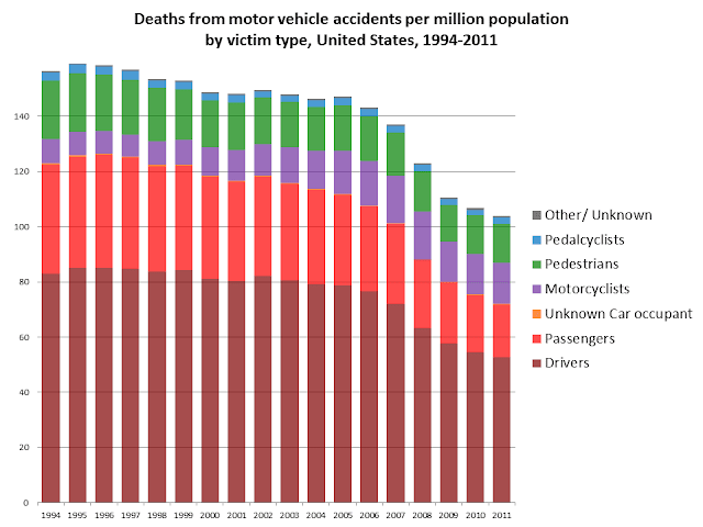
Every once in a while, I like to see what's going on with motor vehicle accidents. It turns out there's a lot going on. This data is from the Fatal Accident Reporting System. I haven't done anything special with it, just graphed the rather bland spreadsheet there on the home page.


 The obvious thing that jumps out at me is that after decades of increases in motor vehicle deaths (the trend goes back to the very introduction of the automobile), we seem to have hit a turning point in 2005, and there were huge drops in motor vehicle fatalities in 2008 and 2009 especially.
The other thing that jumps out at me is the increase in the number of motorcyclists killed on the roads (the purple bars), and perhaps a decline in pedestrian deaths (green bars), and certainly a decline in passenger deaths (bright red bars).
The timing of the precipitous drop in 2008 and 2009 certainly suggests a connection to the recession - fewer vehicles on the roads = fewer deaths. That decline in vehicles would presumably come from three sources: fewer trucks delivering goods, fewer commuters, and fewer errands and pleasure trips. But why would there be more motorcyclist deaths? Perhaps the aging of the baby boom generation? And I haven't got a clue about why there would be fewer pedestrian deaths. It would be interesting to see whether the decline in pedestrian deaths is also linked to the 2008-2009 drops - and could that be attributed to fewer commuters? Or fewer errand and pleasure trips? The drop in passenger deaths seems to be pretty strongly linked to the recession - so is that about less car-pooling among the remaining commuters?
At any rate, graphing the number of deaths is a bit misleading, because the population keeps growing.
So, when you divide the number of deaths by the population (and multiply by 1,000,000), the peak year isn't 2005, but 1995. Actually, if you trace these trends back, the peak year on a per population basis is some time back in the 1920's, when cars were just mowing people down left and right, with very little effort to make the vehicles, the roads, or the drivers safer. What you see in the long term trends is a long slow decline in motor vehicle death rates, followed by a rapid decline in the 1970's, linked to that decade's recession, and also the high price of gas (much much higher than today once you take inflation into account), speed limit restrictions, the imposition of seat belts, investments in improved road infrastructure (guardrails etc.), and a radical shift in how we viewed drinking and driving. The slower decline continued in the 1980's through the late 2000's, especially due to air bags, improved vehicle construction, lighter vehicles that do less damage to others, and continuing trends in driver, vehicle, and road infrastructure safety. But that drop in 2008/2009 is still really dramatic, and I have to wonder if it can all be attributed to the recession.
Presumably, if the decline is due to the recession, it should be directly related to how many vehicles are on the roads. So, if you divide the deaths by 'vehicle miles traveled' instead, it should smooth out the trend...

And that seems to be the case. The long trend towards lower deaths per mile traveled dominates, but there is still an extra bump in 2008/2009, suggesting that the recession not only reduced the number of miles traveled, but also made the miles traveled safer, especially for passengers and pedestrians.

So, as we climb out of the recession, I'd expect to see the number (and rates) of motor vehicle deaths increase a litttle bit, maybe as high as 120 per million residents per year or 12 per billion miles traveled, and then continue the long slow decline.

So, here's another example of major improvements in health being made. Not as sexy a story as the latest fad in diet, but it's good to be reminded once in a while about what's going right.

Monday, May 20, 2013

Data Unicorns

How many unicorns are in your data? Sounds like a silly question. But there can be some major problems when we don't think to ask it. Because every dataset has what appear to be unicorns in it - impossible combinations of data made possible because of infrequent errors.

Rob Kelly, Blackout Tattoo Studio, Hong Kong
Usually it's not a problem because the unicorns make up a really small proportion of your sample. And if the data combination is in fact impossible, or makes up a tiny proportion of what you're really interested in, you can just ignore them, or even try to "correct" them if you have additional information. But when you're interested in a rare phenomenon, it can be hard to tell the difference between unicorns and the real cases you're interested in.

Gay Blood Donors

Take, for instance, a paper I've been working on for years about estimating how many gay blood donors there are.

If the American Red Cross's procedures were followed to the letter, there shouldn't be any because any man who has "had sex with a man, even once, since 1978" is supposed to be excluded. In other words, any apparent gay blood donors should be unicorns –impossible data combinations.

We know that there are some, because every once in a while, someone tests positive during the blood donation screening process, and when they go back to interview the donor, some donors admit to "having sex with a man, even once, since 1978". But we have no idea how many HIV- gay blood donors there are, how many men who are giving on a regular basis without incident, despite the ban.
So, I've been looking at various datasets trying to get a rough idea of how many gay blood donors there are, trying to make the point that the ban on gay male donors isn't just discriminatory, it's also ineffective. And if we could talk with the men who are giving blood regularly without incident, maybe we could develop new exclusion criteria based on what they are doing.

It sounds simple enough, look up how many gay men there are in these datasets, and count how many of them are giving blood. But here's the problem. There are errors in counting who's a gay man, and also errors in counting who gives blood. So, any heterosexual male blood donor who is inaccurately coded as gay or bisexual will appear to be a gay/bi blood donor. As will any gay/bisexual non-donor who is accidentially coded as a blood donor. Let's start out with some plausible (but made up) numbers to illustrate...

Let's give ourselves a decent-sized dataset, with 100,000 men in it. Suppose that 95% of the male population has not "had sex with a man since 1978", and 5% of them have given blood. That's 4,750 straight men who are blood donors.
In the 1970's the Census did a big study where they interviewed people twice, and found that in about 0.2% of the cases, the two interviews resulted in a different sex for the respondent - about one in 500. So, what if 0.2% of these 4,750 guys who are giving blood without bending the rules at all get mis-coded as gay or bisexual - that's about 9 cases of what appear to be excludable blood donors.
Let's just make a guess that instead of 5% of heterosexual men giving blood, that 0.5% of gay/bisexual men do. Then we've got 100,000 x 5% x 0.5% = 25 cases of gay/bi men who are giving blood despite the ban.
So, all told, it looks like there are 34 gay/bi blood donors, but only 74% of them really are gay/bi blood donors.
But what if 0.06% of gay/bi men are really giving blood? Then there would be 3 real gay/bi blood donors, but there would appear to be 12, and only 25% of them would really be gay/bi blood donors. Most of the time, we'd be looking at unicorns.
What's frustrating is that I can't tell the difference between these two scenarios. I can't tell if my unicorn ratio is only 24%, or if it's 75%.

There's another problem, too - with the blood donation questions. Sometimes, people want to inflate their sense of altruism, and they'll say they gave blood in the last year even if it was closer to two years ago. That I can live with, but an even bigger problem is that people get confused by the wording of the question, and they say they've given blood even if all they did was have a blood test at the doctor's office. So, there are some surveys where the blood donation rate appears to be upwards of 25%.
Let's assume that 5% of the population (gay or straight) who haven't given blood say that they have because they mis-understood the question (or that the interviewer was inattentive and hit the wrong button).
Then the number of straight men who say they've given blood would be 10%, not 5%, or 9,500. And if 0.2% of them were mis-classified as gay/bisexual, that would be 19 men who appear to be gay/bisexual blood donors. Then, if we take 5% of the gay/bisexual men as being mis-classified as being blood donors, that would be another 250 men who really aren't blood donors, but appear to be. In that case, if there are really 25 gay/bisexual blood donors, they would make up only 9% of the 294 men who appear to be gay/bisexual blood donors, and if there were really only 3 gay/bisexual blood donors, they would be 1% of the 272 who appear to be blood donors, or in other words, 99% unicorns.
And just to underscore the point, that's coming from errors of 0.2% and 5%.

There is a way to sort through this mess. You'd just need to call the men who appear to be gay/bi blood donors and ask them to clarify on a second interview. The number who would be inaccurately coded twice would be really small, because the relevant error rates are small (0.2% and 5%). But it is unlikely that anyone will do that kind of call-back.

Unicorns Ahead

There are a number of other contexts where we should expect to see unicorns in LGBT health research.
One is transgender health. There are a number of States that have been asking BRFSS respondents if they are transgender, and it looks like about 1 in 500 say that they are. But we need to be very careful in researching this population, because if the 1970's Census estimates hold, it's probably not unreasonable to think that 0.2% of the population will inadvertently be coded as being transgender, and that could easily be most of the people identified as transgender in these surveys. Again, the easiest solution is to call people back to verify. But in the absence of a call-back survey, we won't know whether 70% of the people identified as trans are actually trans, or if only 7% are.
Another group heavily influenced by unicorns is married same-sex couples. Before 2004, almost all people identified as married same-sex couples in the United States were unicorns, because it wasn't a legal status available to anyone. Another analysis I'm working on shows that the proportion of people identified in surveys as married same-sex couples who are really married same-sex couples can be as low as 10%, and rarely gets above 50%, but it's getting better in states where marriage is legal.