 I've been looking at how people voted on California's proposition 8 (the one in 2008 that restricted marriage to mixed-sex couples) at the voting district level for a project to try to characterize normative heterosexuality within small areas.
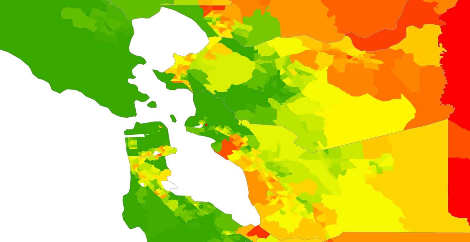
These maps show voting behavior at the census tract level (census-defined neighborhoods of ~4,000 residents).
Yellow = 50% support
The darkest green = 35% or less
The brightest red = 65% or more
(white = fewer than 100 votes cast in that area - often airports, sometimes just very unpopulated)
San Francisco bay area.
Los Angeles area. It is surprising to me how polarized this issue was.

No comments:
Post a Comment